

Semiotics in design: tech is changing the codes of health
McKinsey estimate the value of the global ‘Wellness’ space at $1.5tn. It is the perfect lens to view how cultural change can affect coding around one of our most primal drivers, our own health and wellbeing
It’s hardly surprising that it’s a complex space across multiple categories with multiple design codes. What is interesting is that we can see how some fundamental changes in the cultural currents are driving new and successful codes
We will talk more in a later post about how far behind brands are in a changing conversation about the body. Most are stuck in a space that treats the body like a car, made up of multiple parts that can be analysed and treated as distinct components. The conversations outside the brands are far beyond this, the body is increasingly recognised as a complex, interrelated ecosystem, not a biological machine
With technology increasingly important in the health and wellness space through things like wearables and apps, it’s really interesting to review how the codes of technology are influencing other products
Increasingly efficacy looks like tech – it’s the way we get stuff done. Older codes of efficacy in health are overtly clinical and often alienating and depersonalised. In contrast, the best of tech brings not only simplicity and clarity to a massively complex area, but also humanity

As always, Apple shows how it should be done. As the Apple watch dominates the health wearables sector, their ability to translate complex information into simple, intuitive imagery with and bright and optimistic style is filtering out into the wider culture
We are already seeing massive growth in brands operating in another important space, that of personalised health and wellness. And while it seems obvious in hindsight to use tech codes in this science driven category, originally the semiotics in design of these offers was old style efficacy – clinical, white, clean, dehumanised. Now we are seeing bright colours, simple graphics, optimistic or just straightforward language
Sometimes, as with DNA Nudge (DNA testing then links you to a device to scan barcodes to find the products right for you), the look is still complex but they’ve introduced some colour
But Vitl is an example of how personalised healthcare offers can learn from brands like Apple

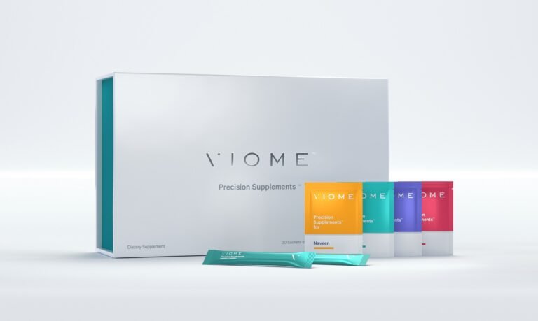
Viome are still split between the clinical and colour worlds
It’s filtering out to other offers too – in a complex area the benefits of talking straight to consumers are weirdly overlooked. So kudos to brands like Mayawell, who tell it exactly like it is – or rather, explain exactly what it is

We are going to see more of that clarity and optimism across the health sector as the brands address the impact of cultural change – let’s look forward to it